
Sustainability is Sexy (SIS)
Sustainability is Sexy (SIS)
Sustainability is Sexy (SIS)

Overview
Overview
Overview
I worked in a team of five to collaborate with the waste-diversion and sustainable education nonprofit SIS and redesign their website.
I worked in a team of five to collaborate with the waste-diversion and sustainable education nonprofit SIS and redesign their website.
Timeline:
Apr 2025 - Jul 2025
Timeline:
Apr 2025 - Jul 2025
Role:
Web Designer
Role:
Web Designer
Role:
Web Designer
Team:
5 Designers
2 Stakeholders
Team:
5 Designers
2 Stakeholders
Skills:
Squarespace
Responsive Web Design
Design Implementation
Audience:
Event Organizers
Company/School Leaders
Skills:
Squarespace
Responsive Web Design
Design Implementation
Skills:
Squarespace
Responsive Web Design
Design Implementation
Audience:
Event Organizers
Company/School Leaders
Audience:
Event Organizers
Company/School Leaders
Define
Define
User Research
User Research
Competitive Analysis
Competitive Analysis
Iterations
Iterations
Implementation
Implementation
Reflection
Reflection
DEFINE
DEFINE
The problem? Too many blank pages!
The problem? Too many blank pages!
The problem? Too many blank pages!

SIS had an original website that was a skeleton of what they strived for it to become. Many pages were empty and haven’t been updated since it was first created years prior. Our client specifically expressed the need for a more prominent donation page, easily updatable impact numbers, more emphasis on their services/podcast/events, and to make sure their website isn’t “boring.”
We formalized our guiding question: how might we redesign the SIS website to better communicate their brand and promote their services/events?
SIS had an original website that was a skeleton of what they strived for it to become. Many pages were empty and haven’t been updated since it was first created years prior. Our client specifically expressed the need for a more prominent donation page, easily updatable impact numbers, more emphasis on their services/podcast/events, and to make sure their website isn’t “boring.”
We formalized our guiding question: how might we redesign the SIS website to better communicate their brand and promote their services/events?
USER RESEARCH
USER RESEARCH
But first, let's see what their current users think
But first, let's see what their current users think
But first, let's see what their current users think
To gain insight from SIS’s audience, we sent out a Google Form for feedback on navigability and surface level aesthetics. Common responses include:
To gain insight from SIS’s audience, we sent out a Google Form for feedback on navigability and surface level aesthetics. Common responses include:

These matched what our clients brought up: the need to build upon what they have and make it feel “more like SIS.”
These matched what our clients brought up: the need to build upon what they have and make it feel “more like SIS.”
COMPETITIVE ANALYSIS
COMPETITIVE ANALYSIS
Understanding how other sustainability consultation/education websites add personality and communicate information
Understanding how other sustainability consultation/education websites add personality and communicate information
Understanding how other sustainability consultation/education websites add personality and communicate information

Ocean Conservancy utilizes large graphics/photos and asymmetrical borders, bringing personality to their website. I especially want to note the eye-catching impact statistics numbers that not only add visual interest, but showcase important information and proof to their audience that they’re making a difference–ultimately building credibility.
Ocean Conservancy utilizes large graphics/photos and asymmetrical borders, bringing personality to their website. I especially want to note the eye-catching impact statistics numbers that not only add visual interest, but showcase important information and proof to their audience that they’re making a difference–ultimately building credibility.
ITERATIONS
ITERATIONS
Balancing visuals with text-heavy copy to reduce excessive page length
Balancing visuals with text-heavy copy to reduce excessive page length
Balancing visuals with text-heavy copy to reduce excessive page length
SERVICES
SERVICES

Throughout these iterations, this page was getting pretty lengthy, prompting me to cut down on information like impact statistics per service. This choice was backed with the notion that the information is repetitive given these numbers are also displayed in the Impact page. Additionally, since this page was copy-heavy, I added anchor links and back-to-top buttons for a more efficient user experience.
Throughout these iterations, this page was getting pretty lengthy, prompting me to cut down on information like impact statistics per service. This choice was backed with the notion that the information is repetitive given these numbers are also displayed in the Impact page. Additionally, since this page was copy-heavy, I added anchor links and back-to-top buttons for a more efficient user experience.
IMPACT
IMPACT
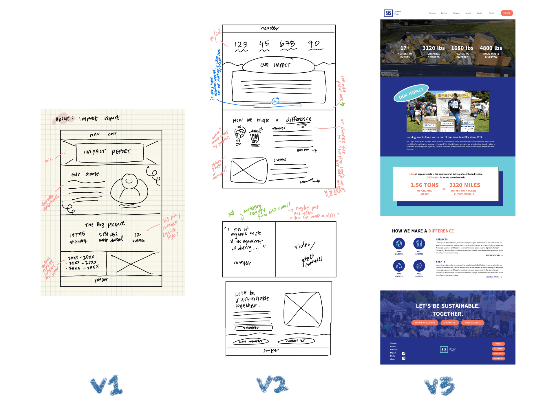
Before, it wasn’t clear exactly how much of an impact SIS has made in their community. So to emphasize this, I used large numbers as an eye-catching element, placing them within the hero to share their impact right from the start. Midway through the project, my client asked me to include a new marketing strategy, showcasing the conversion rate of organic waste to driven miles to provide an additional way for users to digest the information. Utilizing the card style from our design system, I created and added this visual.
Before, it wasn’t clear exactly how much of an impact SIS has made in their community. So to emphasize this, I used large numbers as an eye-catching element, placing them within the hero to share their impact right from the start. Midway through the project, my client asked me to include a new marketing strategy, showcasing the conversion rate of organic waste to driven miles to provide an additional way for users to digest the information. Utilizing the card style from our design system, I created and added this visual.
RESOURCES
RESOURCES
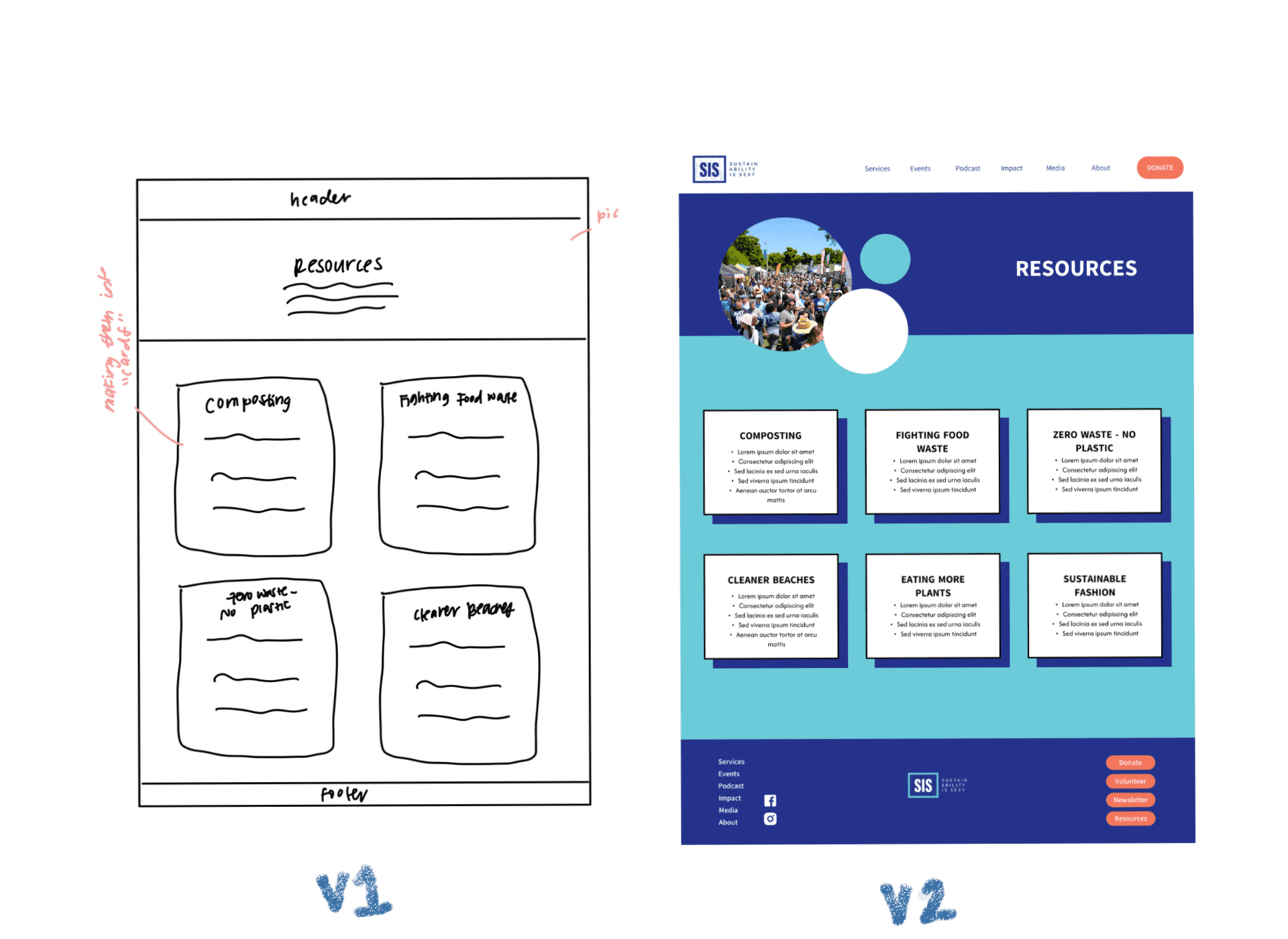
I was originally tasked with redesigning the Services and Impact page, but was onboarded the Resources page as well to update the UI and match the new design system.
I was originally tasked with redesigning the Services and Impact page, but was onboarded the Resources page as well to update the UI and match the new design system.
IMPLEMENTATION
IMPLEMENTATION
We had to adjust our original designs to comply with Squarespace’s fluid engine
We had to adjust our original designs to comply with Squarespace’s fluid engine
We had to adjust our original designs to comply with Squarespace’s fluid engine
SERVICES
SERVICES

HEADER
Changed anchor link buttons to clickable text due to responsiveness issues and reduce overuse of CTA color.
HEADER
Changed anchor link buttons to clickable text due to responsiveness issues and reduce overuse of CTA color.

TESTIMONIALS
I was unable to implement my original design because it was excessively lengthy on mobile. Instead, I opted to use one of Squarespace’s templates which also makes upkeep easier.
TESTIMONIALS
I was unable to implement my original design because it was excessively lengthy on mobile. Instead, I opted to use one of Squarespace’s templates which also makes upkeep easier.
IMPACT
IMPACT

ICON LAYOUT
The organization in V3 wasn't responsive as it kept resizing. I rearranged them in V4 to ensure responsiveness and match the mobile layout for consistency.
ICON LAYOUT
The organization in V3 wasn't responsive as it kept resizing. I rearranged them in V4 to ensure responsiveness and match the mobile layout for consistency.
REFLECTION
REFLECTION
This was the first time I partnered with a client to work on a redesign
This was the first time I partnered with a client to work on a redesign
This was the first time I partnered with a client to work on a redesign
I faced many struggles when it came to ideation and implementation due to my lack of experience, but our stakeholders provided us valuable feedback and guidance. They truly pushed us to think outside of the box.
As of December 2025, their website’s traffic has risen 43.75% since we implemented and published our designs! I think it’s truly a rewarding and amazing feeling to see our designs make a real-world impact :^)
I faced many struggles when it came to ideation and implementation due to my lack of experience, but our stakeholders provided us valuable feedback and guidance. They truly pushed us to think outside of the box.
As of December 2025, their website’s traffic has risen 43.75% since we implemented and published our designs! I think it’s truly a rewarding and amazing feeling to see our designs make a real-world impact :^)

Thank you so much to team Sustainability is Sexy for trusting us beginner designers with your website—it was a pleasure working with you!
Thank you so much to team Sustainability is Sexy for trusting us beginner designers with your website—it was a pleasure working with you!
more works !
more works !

FLY App
FLY App
Ensured Fresh Lifelines for Youth's (FLY) app meets accessibility and trauma-informed design standards.

Mon Chourie Original Website
Mon Chourie Original Website
Designed a responsive, original website for the local small bakery Mon Chourie.
Designed a responsive, original website for the local small bakery Mon Chourie.
